 Milometry
Insights and the heatmap
What each card on the Insights tab shows, how to look at a past tax year, and the map of everywhere you have driven.
Chapters
Transcript
General information, not advice. Written as general information on 27 September 2026. Details change, so check the official source or a qualified professional before you rely on it. This is not legal, tax or financial advice.
The Insights tab turns your sorted trips and fill-ups into a handful of cards: what your business mileage is worth this year, how much you drive week by week, whether your log is missing anything, and what the car costs to run. At the bottom is a map of every route you have recorded.
Only trips you have sorted as business or personal count here. Trips still waiting in the Classify tab do not, except where the page says so below.
1. Pick the tax year and the period
Open the Insights tab. Across the top are up to three rows of buttons:
- Tax years. Once you have trips in more than one tax year, a button appears for each one, newest first. Tap a past year to see it. The year follows your mileage scheme: April to April for HMRC, for example.
- Month, 3 months and Tax year. Month and 3 months always show your most recent driving. Tax year shows the whole of the year you picked above, month by month.
- Cars. With more than one vehicle, pick one, or All cars.
2. The claim card
The first card is titled with your scheme and the year, for example Mileage at HMRC rates · 2026-27. The big figure is what your business trips in that year come to at the approved rates. Under it:
- how many business miles you have logged in the year,
- how many are left before the rate drops, and at what rate, or the rate you are now on,
- a bar showing how far through the higher band you are.
A past year is priced at that year's own rates, not today's. For HMRC that matters: the rate for the first 10,000 business miles went from 45p to 55p from 6 April 2026, so a 2025-26 figure is at 45p and a 2026-27 figure at 55p.
Under the card is Estimate at HMRC rates, not tax advice. Tap it for the full explanation. On UK rates there is a second line too: if your employer already pays you mileage, you can only claim relief on the shortfall, and relief reduces your tax rather than paying you this amount.
3. Distance per week
The next card is a bar chart of business and personal distance, one bar per week, with each total in the legend above. In the Tax year view it becomes Distance per month. Swipe the chart sideways to see earlier bars.
4. Unlogged mileage
This card only appears when your odometer readings from fill-ups cover more distance than your recorded trips do. It shows the missing total and up to four stretches, each with its dates, the odometer distance and the logged distance. Tap Add trip on a stretch to open a new trip with the distance filled in and dated inside that gap.
Here, trips still waiting to be sorted do count as recorded, so a backlog in the Classify tab is not mistaken for missing miles. Fixing missed drives covers what to do next.
5. How complete is the log?
Once you have logged a fill-up with an odometer reading, this card lets you check the whole log in one go. Tap Check against the odometer, then type the reading on your dashboard now. It tells you how much of the distance the car has covered since your first reading is on record, as a percentage. Do this once you are parked.
6. Fuel
The Fuel card shows what you spent on fuel in the period, your real economy once two full tanks have measured it, and an estimate of the carbon dioxide from your trips.
- The CO₂ figure is worked out from the fuel economy you entered for the car and its fuel type. It is an estimate of what came out of the exhaust, not a measurement. An electric car counts as zero.
- A true cost line appears if you have entered yearly running costs for the car, such as insurance and tax. It spreads those, plus a year of fuel, over a year of driving, to give a cost per mile.
- Below is a line chart of your real MPG, one point per full tank. Pick a single car to see it.
7. Everywhere you've driven
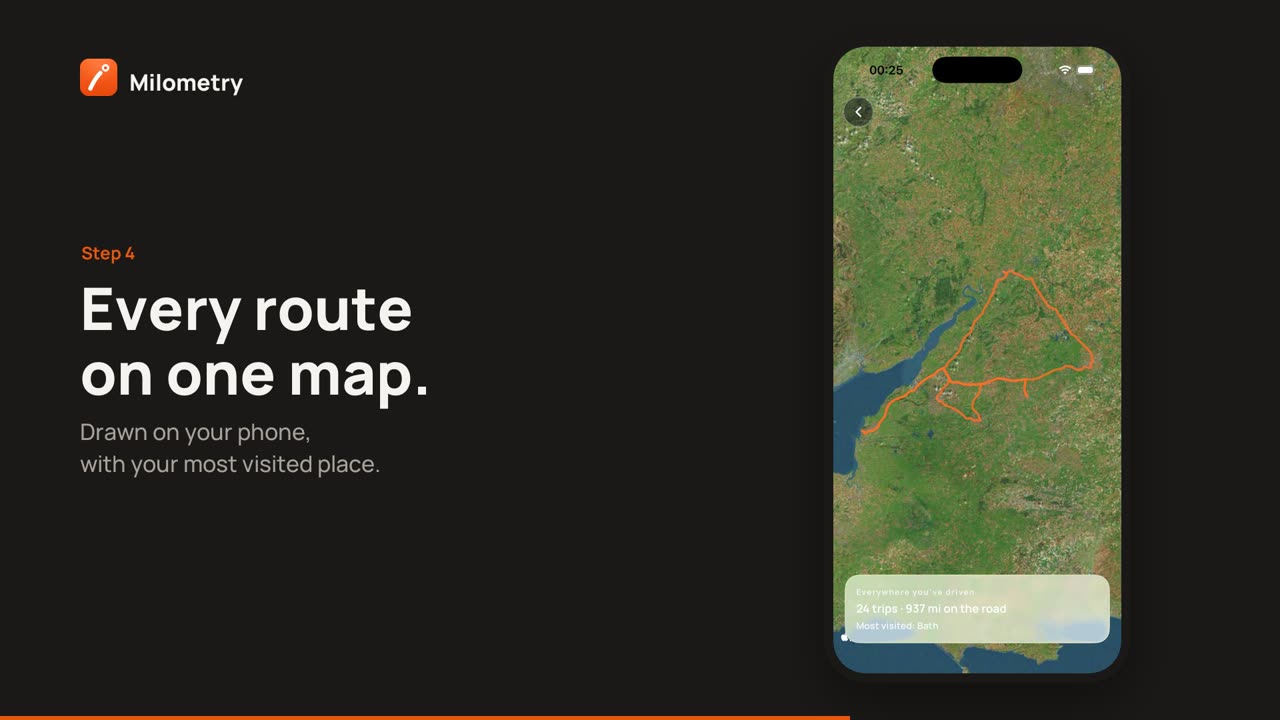
At the bottom, tap Everywhere you’ve driven. A satellite map opens with every recorded route drawn on it, business, personal and not yet sorted. Deleted trips are left out. The busier a road, the brighter it glows.
The card at the bottom gives the number of trips, the total distance, and your most visited destination. Pinch and drag to look around, and tap the back button to return.
The routes are drawn on your phone. The map pictures come from Apple on iPhone and Google on Android, like every map in the app.
If something is not right
- The claim looks lower than expected. Only trips sorted as business count. Check the Classify tab for any still waiting.
- No tax year buttons. They only appear once you have trips in more than one year.
- No CO₂ figure. The car needs a fuel economy figure. Add one in Settings → Vehicles.
- The MPG chart is empty. Pick one car, and log two full tanks with odometer readings. See Logging a fill-up.
Sources
- EIM31240: approved mileage allowance payments, rates, HMRC
- Increasing mileage rates, HM Treasury and HMRC
- EIM31330: mileage allowance relief, HMRC